Through my company Product Science, for the last three years I’ve been working with Growing Communities a non-profit organisation set up in the 90s to get good, fairly traded, organic food to people in a neighbourhood, in an environmentally, socially, and financially sustainable way. In the summer of 2015, during a strategy planning workshop together we used Simon Wardley’s Value Mapping technique (often referred to as Wardley mapping) to help work out a strategy for a key part of the organisation’s activity: their weekly veg scheme. With their permission, I’m sharing this write-up to help share examples of using Wardley maps in the wild, as a handy reference point for others.
Setting the scene

Over 2014, I started working with Growing Communities, an NGO committed to making affordable, organic food available in Hackney, creating long term relationships with farmers around London, and creating jobs in the local neighbourhood. This short video below gives an idea of what they’re about. They’re a lovely bunch.
That’s nice. What does this have to do with mapping?
As mentioned in earlier (and in the video) Growing Communties runs a box scheme. A during a half day workshop, after running through a short deck introducing the concept, a handful of us had a go at mapping this out together, with some post-it notes, markers. It looked a bit like this:

Tidying this up a bit
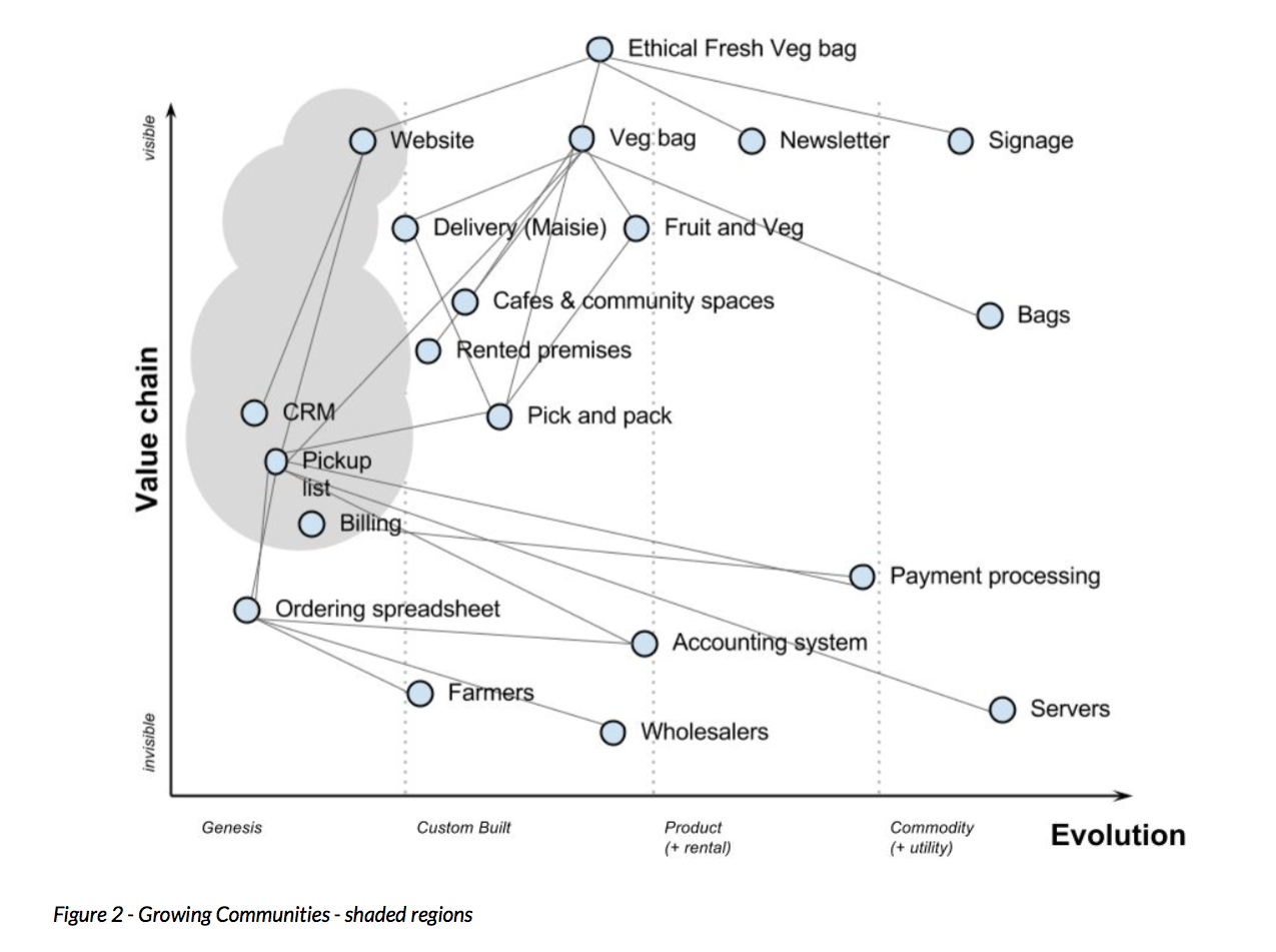
Tidied up it looks a bit more like this:

At the top of this, we had a user need for “ethical fresh veg“. To help meet this need, we relied on a) a website for people to see what’s available, and place orders, b) a veg bag of produce, c) a newsletter we used to tell members what was in the bag this week, with some links to recipes, and d) for publicity and to help people pick up their bags, printed matter which we referred to as ‘signage‘.
On order to deliver the veg bags, we also needed a way to deliver them (in this case, it was Maisie the Milkfloat who took care of delivery), as well as fruit and veg from the farms. Growing Communities isn’t a box scheme – you pick it up from a specific place instead of having vans drop it off to you, so we needed somewhere for member s to pick up the bags of produce. In this map you can see this as Cafes and Community spaces on the map, some of which were rented (hence the rented premises).
The website was more than a brochureware site, there was a hand-rolled CRM of sorts in it depths, which also helped generate a packing list of who had ordered product in a given week. This packing list is what staff use to work what product they should put into the bags to be delivered, but this packing list is also what is used to work out what to order each week, and also what to collect from customers via a payment processing system. Other staff would put the numbers of active customers each week into a custom ordering spreadsheet, and then use these numbers of people ordering in a given week, as a guideline for what kind of budget they had to spend on ordering product from local farmers and wholesalers.
From data recorded in a packing list each week, you could generate data for checking in an accounting system, and yes because there was a fairly complex website and a number of automated systems, we relied on some servers to run our programs on.
So that’s our map, abridged.
Representing our own stack in this map
I referred to a few automated processes and a website in the previous section. While these were different activities, the reality was that a single monolithic Django application powered all of them, and to represent, this, I’ve shaded it it grey.
Building an app as a monolith when starting out tends to help you deliver features quickly, but over time, it becomes they can become harder to manage, and frequently, productivity when working on them drops off, as you end up managing an ever growing ‘ball of mud’. This is compounded if you are running an application on a ‘snowflake’-like server set up, which is the only working version of a given site.
Lots of the Growing Communities stack was custom, and had been built by a developer who was no really longer around to work on it, and when the this stack was built, lots of this had to be done a custom one-off work, because there were few suitable products to do some of these jobs for you.
However, everything evolves
While a Wardley Map nice for giving a point in time snapshot of a service’s of an organisation, being able to show movement over time is extremely useful for helping people in a room understand how common ways of carrying out an activity may change over time.
I’ve represented this in the map below – as I mentioned before, the shaded grey area represents a big ol’, hard to change custom django application, and the arrows highlight areas of the value chain, where there are clear examples of evolution to a more well understood, commodity-like offering. I’ll cover websites and delivery below in more detail to explain this in more detail:
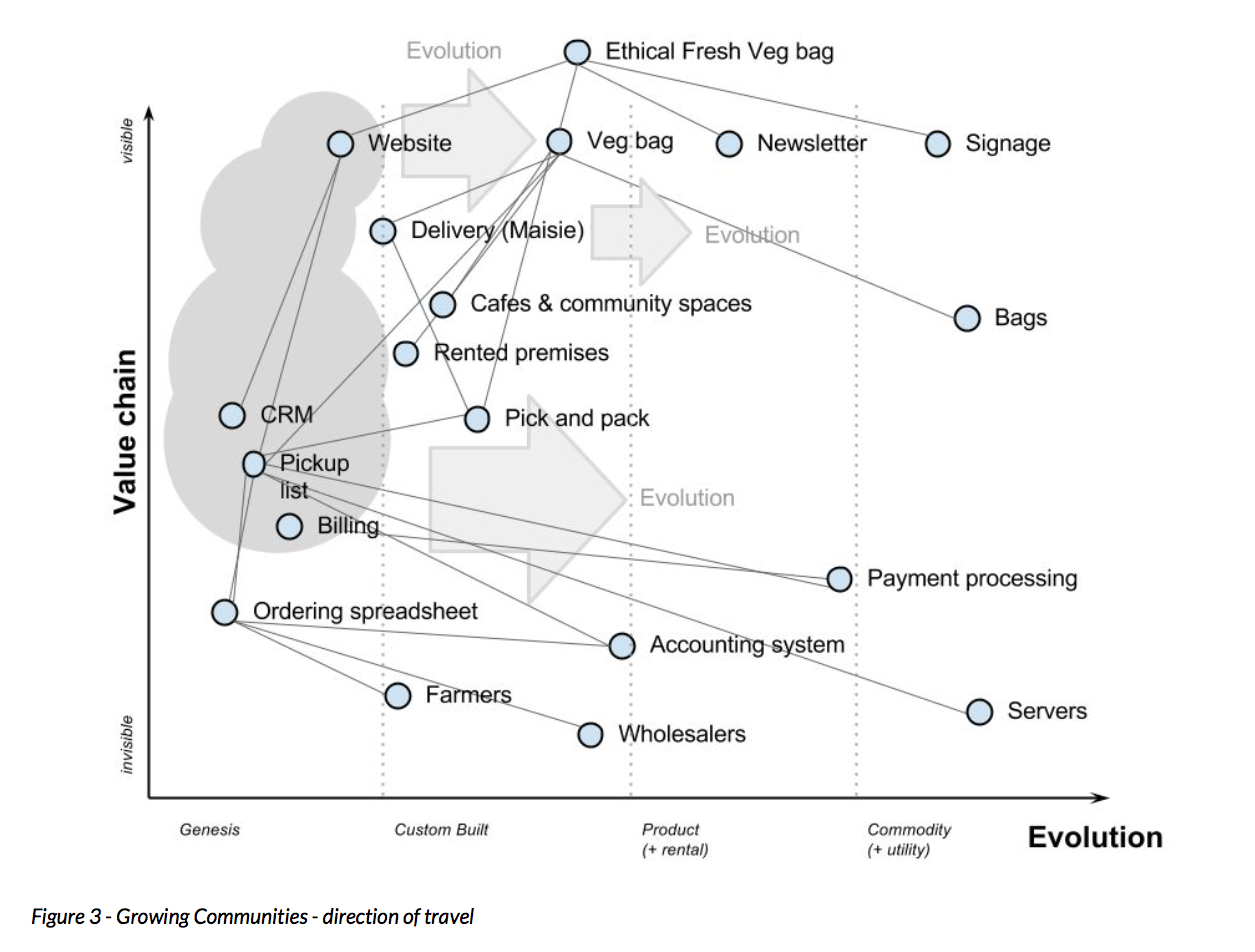
Evolution in websites
Over the last 5 years or so, it’s safe to say building websites has become a more commonplace activity, and popular products, like WordPress have grown to be much more capable, sophisticated and well understood. If you compare the WordPress of 2008, to the WordPress of 2017, you’ll see a much more powerful product, but also a vibrant ecosystem of hosting services, products built on top of it, and companies who provide development services, which means you have a wider range of suppliers to choose from.
WordPress is one clear example we were thinking when making this map, but it’s not the only one. There are a number of closed source and open source products available now if you want to get a website up, and you don’t want to be tied to a single supplier.
Evolution in delivery
You can also see evolution in the delivery area, where I’ve added another arrow – just hiring hiring a car, or small van on a per hour basis has become much easier, and more commonplace thanks to companies like Zipcar and so on, This might not be as charming as Maisie the Milkfloat, but operationally, it’s much simpler, and finding spare parts for milkfloats isn’t getting any easier. Also utility like pricing means that you end up only paying for the time you’re using it, and you’re not committing for a long term either – good if a vehicle isn’t in constant use all week, or the use patterns change.
Sketching out a new world
So, we were able to use maps to sketch out our own value chain, and we were able to sue them to identify areas of evolution that we might want to take advantage of, when thinking strategically about our future.
In addition to using a map to talk about what changes have taken place, you can also use maps to describe a possible future shape of a value chain, and talk about the pros and cons of these different approaches.
If we were to start a new veg scheme tomorrow with no legacy infrastructure
If you were setting up a veg scheme tomorrow, and you already had years of experience running one, you might not build everything as a single monolithic system straight away. In general, I agree with Martin Fowler’s advice that monoliths are good to start out with when you’re exploring a problem or building a first pass at something. Once you’ve identified the main jobs a system is doing, there is an argument for breaking this into smaller services, and letting specialised tools to specific jobs.
A sample map, without building a website CMS yourself
The map below, outlines one possible approach we considered. While some parts of running a weekly veg scheme, were unique to Growing Communities, other parts, like maintaining a website, and letting people sign up to the scheme weren’t, and we explored having two separate systems – one well under product looking after a website like WordPress or Drupal, and where the recurring billing, and specific delivery rules were needed, we’d continue to build this in-house.
This is why in the map below we no longer have the amorphous blob representing a huge, old do-everything django app, but instead we have two separate shaded regions to represent the two systems at work – one for the more commoditised, commonly understood CMS-powered website, and one for the more bespoke system handling billing, generating packing lists for customers and so on.
If you have a smaller system custom system, there’s less code, and hopefully fewer concepts for a new developer or team to understand before they can be productive on, meaning that you’re less dependent on a single supplier.

How the map informed the final strategy
If you go to the Growing Communities website, you’ll see a website powered by the Drupal CMS put together by an agency that specialises in creating websites in Drupal. This speaks to Boxmaster, a commercial product designed specifically for organisations running veg box schemes.
This replaces a single hard-to-change, monolithic django application, which was appropriate for exploring the problem and building a service around, but was only really understood by two people, who were not core parts of the staff, nor were they working on building veg box schemes full time.