I’m sharing this idea in half-baked form, because increasingly, when I think about electricity grid, I want to visualise it in this way to help understand the differences between various ways a power grid can be structured.
If you think of energy has a gradient in the Z-axis where resources (as in generation) are peaks, and loads are troughs, then I think you can build a 3D topology of an energy grid that would be a helpful and interesting visual.
I think it can then help explain why you might want a distributed grid which is comparatively flat, by versus a ‘spiky’ grid with a few very large resources that are paired with comparatively large loads, but requiring lots of transition to make it work.
Having a flatter grid means you place less demands on transmission, and also provide more local redundancy. This means you end up with systemically speaking, a less vulnerable grid.
Transition (at least in the big pipes capital T sense) is important, but it’s also somewhat lossy, and vulnerable, and when you have very heavy loads on the grid, it imposes a kind of weight against anything that’s caught in the ‘gravity well’. This is because the load is so heavy, it can distort the cost and availability of electricity for nearby groups.
This applies in a weaker form with say… water stress from energy use too – datacentres rely on water to cool down servers for example. Also, generating electricity by itself via thermal means is a draw on water – you need water to make steam to turn turbines to generate electricity.
To do this though, you’d need access to a map of generation (i.e. power plants, etc), and a map of estimated load (i.e. how much different kinds of power buildings might use, perhaps on a power used per square meter basis). I think this data might exist in a low res form though. We have lists of all the power stations in the world, on OpenInfraMap, which consumes a layer in OpenStreetMap.
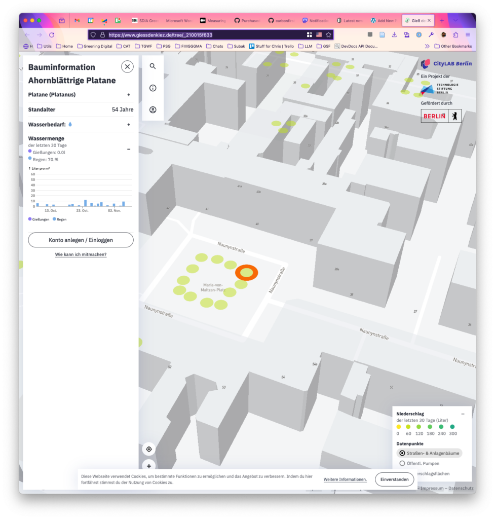
And the screenshot below shows cool 3D models of all the buildings in Berlin, as open data, on the website Giessdenkiez. If these buildings exist, I figure they might be categorised somehow based on the kind of usage too:
So tha’s the idea. Does this exist already anywhere? I figure there are enough map nerds in the world that someone would have tried making it. TBH, it’s not necessary to use the third dimension to depict load or generation, but it just seemed a novel way to present it. You coudl likely user color just as easilt, but it didn’t seem so cool (though probably easier to make a prototype of…)